The early experience with blogging and website platforms was not satisfactory. On one hand, UBC blogs was not easy to learn and it did not provide enough flexibility for students to consider it an attractive way to present themselves. On the other hand, commercial website builders like Wix and Squarespace were too flexible and students were both lost and too focussed on design.
Our solution was to use Wordpress, but customize a modern theme heavily so that it guided users in the process of building an eportfolio. The cost and sustainability was solved by using Wordpress mulituser. It also needed to be scalable to potentially 100,000 sites.
Jason Myers and Fred Cutler sketched the first wireframes, which evolved through some consultation. Michael Ha was the software engineer who made it come to life.
The design principles were:
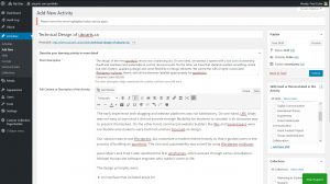
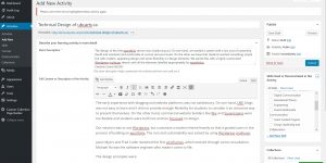
- An interface that included areas for Learning Activities, with a title, abstract, body, and a separate area for reflection called "Learning Significance"
- User-defined "Skills" as tags that could be applied to any Learning Activity
- Auto-population of a student's Courses for Activity tagging
- "Custom Collections" so students could group their Learning Activities as special collections, allowing the same Activity to appear in multiple collections defined by different learning contexts or by wanting to present to different audiences
- Limited customizability of layout and menus and fonts, but enough so students felt like it could look unique and individual with creative use of fonts and media.
- Ability for students to be able to set Activity posts and Collections as public, link shared, or private.
You can see the back end, as we entered this post...

Next: 8. Marketing ubcarts to Students

This was truly walking a tightrope. When we heard criticisms from 'both sides' -- too limiting AND too customizable -- we knew we were in the right ballpark. We will continue to iterate the interface to improve the user experience and keep up with contemporary design.